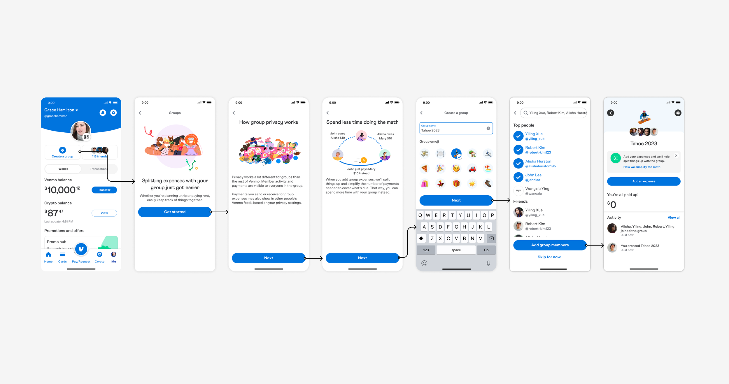
VENMO GROUPS
In November 2023, Venmo launched its new Groups feature. From the start of this project, I partnered with product, UX design, legal, risk, compliance, knowledge management, and UX research to create simple, engaging, and educational content for the Groups feature. This content guides users through the process of creating a group, inviting new members, and adding, splitting, and paying for shared expenses, directly increasing Venmo’s user base and overall number of payments.
Project info
Duration: 12 months +/-
Employer: PayPal | Venmo
Role: Sr. Content Designer
Mediums: Figma
Overview
A 2022 survey indicated that a group feature was requested by 29% of Venmo users. Yet up until 2023, it wasn’t possible for Venmo users to manage and split multiple shared expenses. Specifically, there were a few problems we were aiming to solve:
Managing expenses within a group is tedious, time consuming, and requires coordination
Dealing with finances takes away from the quality of the group experience
Going back and forth between apps, spreadsheets, and other tools is tiresome and impacts the group experience
Goals:
Remove the complexity and strain that can result from multiple shared expenses
Make it easier for users to manage, track, split, and pay for group expenses
Key metrics
Increase user engagement
Increase total payment volume per user
Increase active users
Content strategy
Make it possible for groups of Venmo users to easily manage, split, and pay for shared expenses by creating simple, engaging, and educational content for Venmo’s new Groups feature.
General approach
Align with product on the goals and vision for Groups
Develop content strategy statement
Partner with design to create early mocks
Conduct user testing to identify any points of friction or confusion
Leverage user feedback to iterate on the designs and content
Review final content with risk, compliance, and legal for final approval
Iterate, iterate, and iterate some more
Phased launch to assess impact and improve as needed
Results
Initial user testing helped us identify a few points of friction and confusion. We were able to quickly remedy those issues to make the content and designs more intuitive. The overall content direction was supported through user feedback which identified that users founds it “clear how to join a group and add an expense.”